The Goal
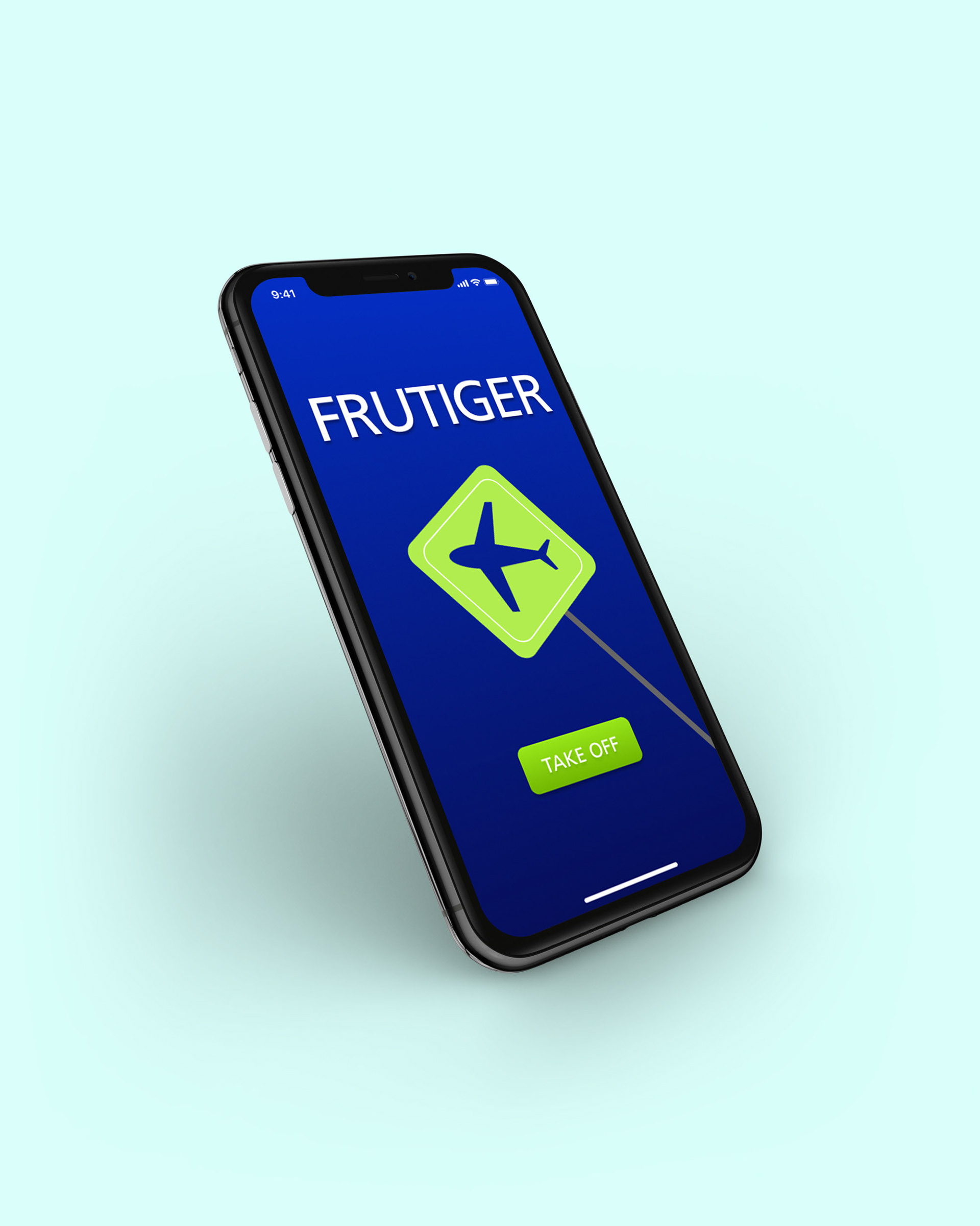
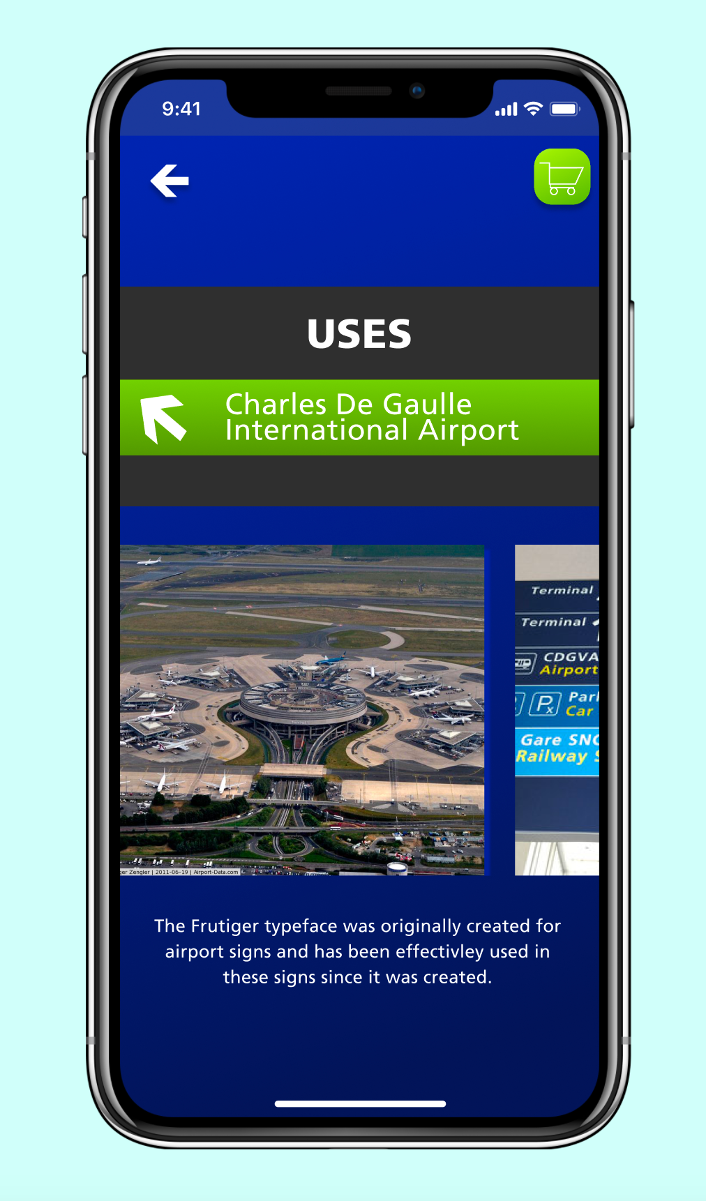
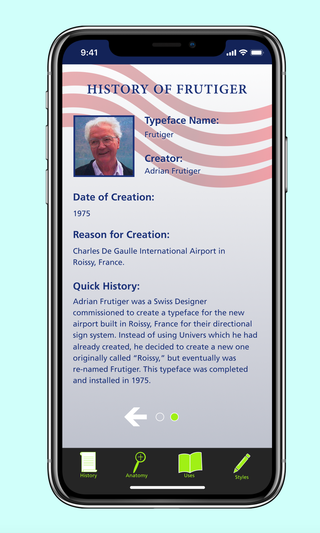
Our task for this assignment was to research and design an app based on an assigned typeface. I was assigned Frutiger which was originally designed for airport signage in France, so I based my concept around the airport experience.
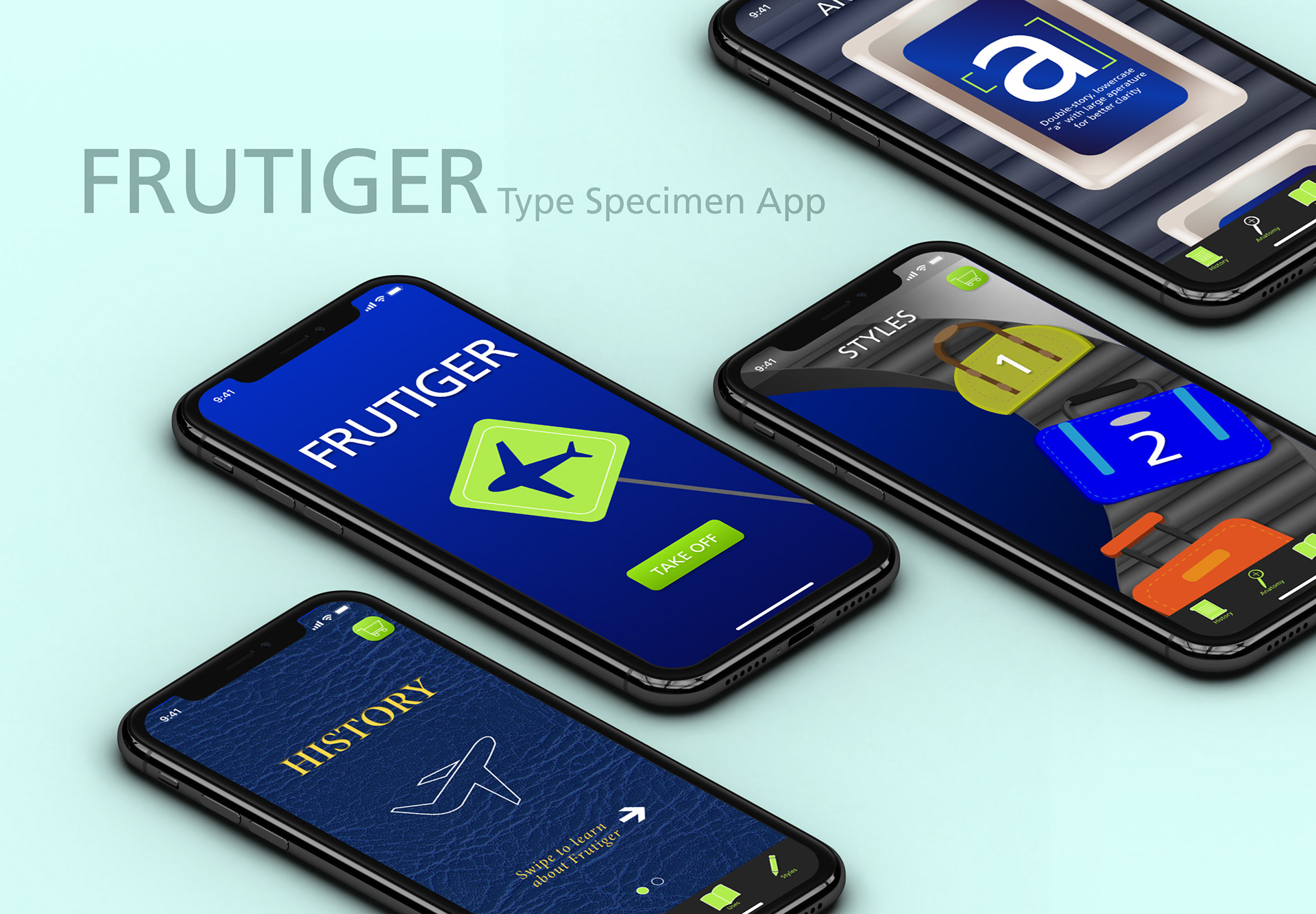
My Concept
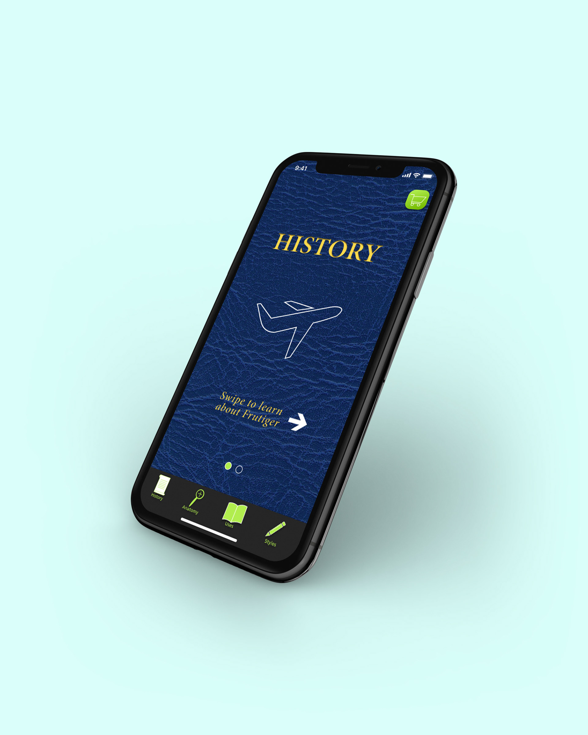
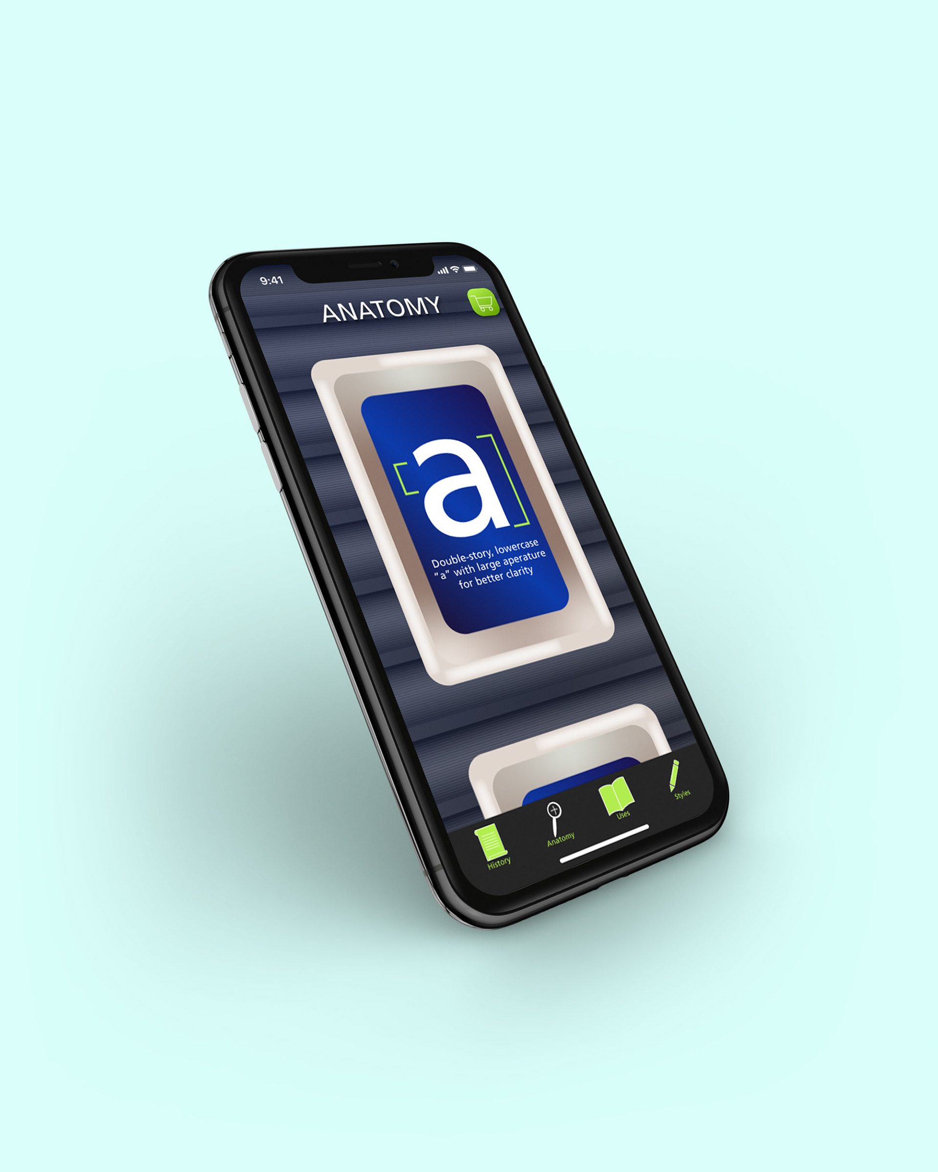
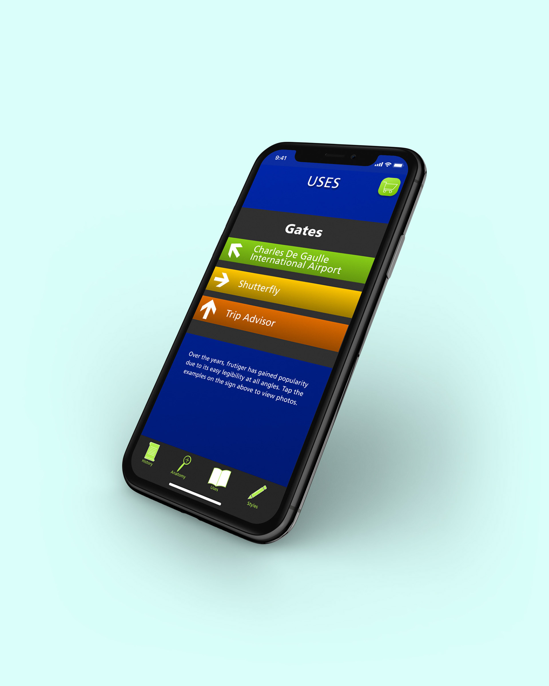
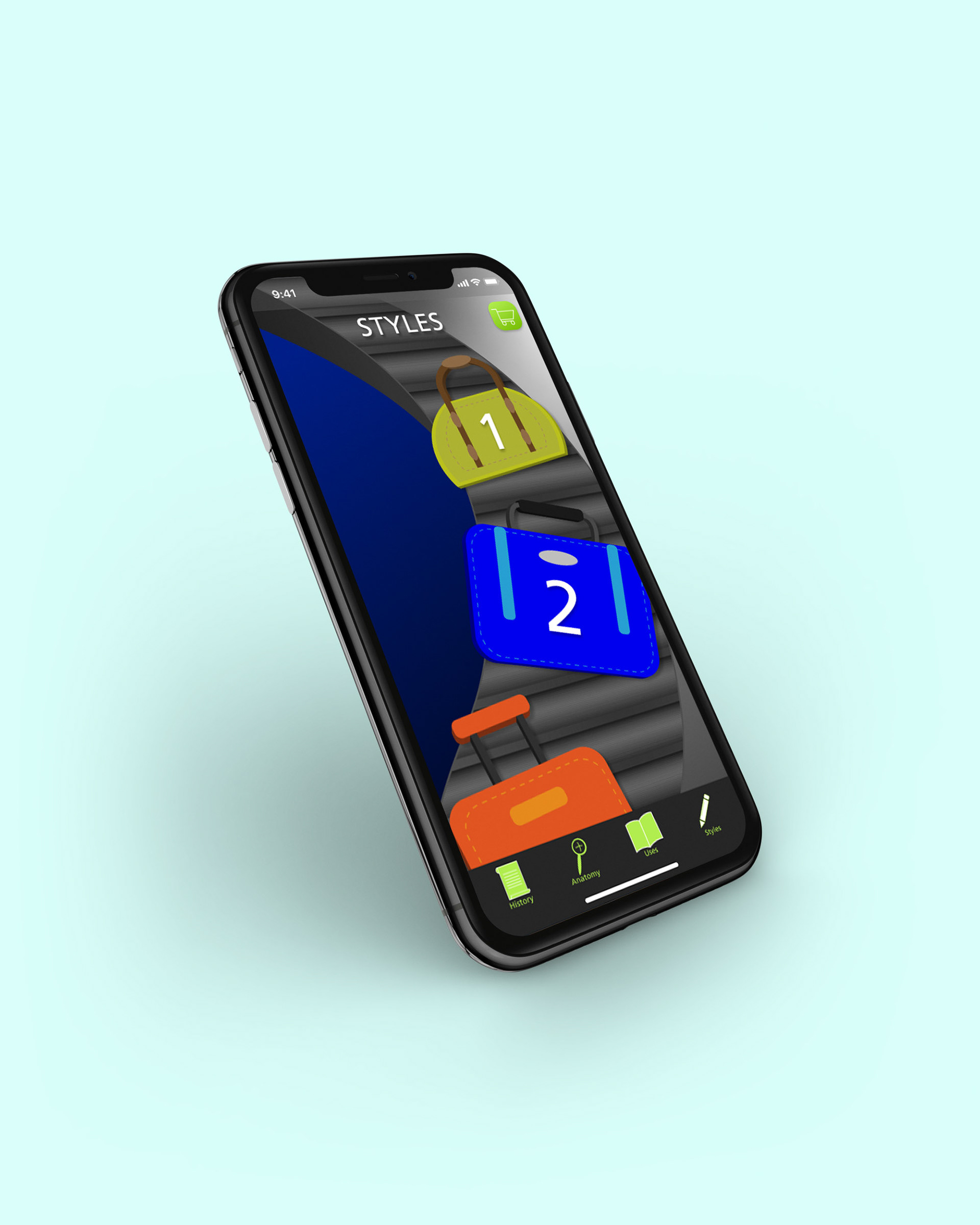
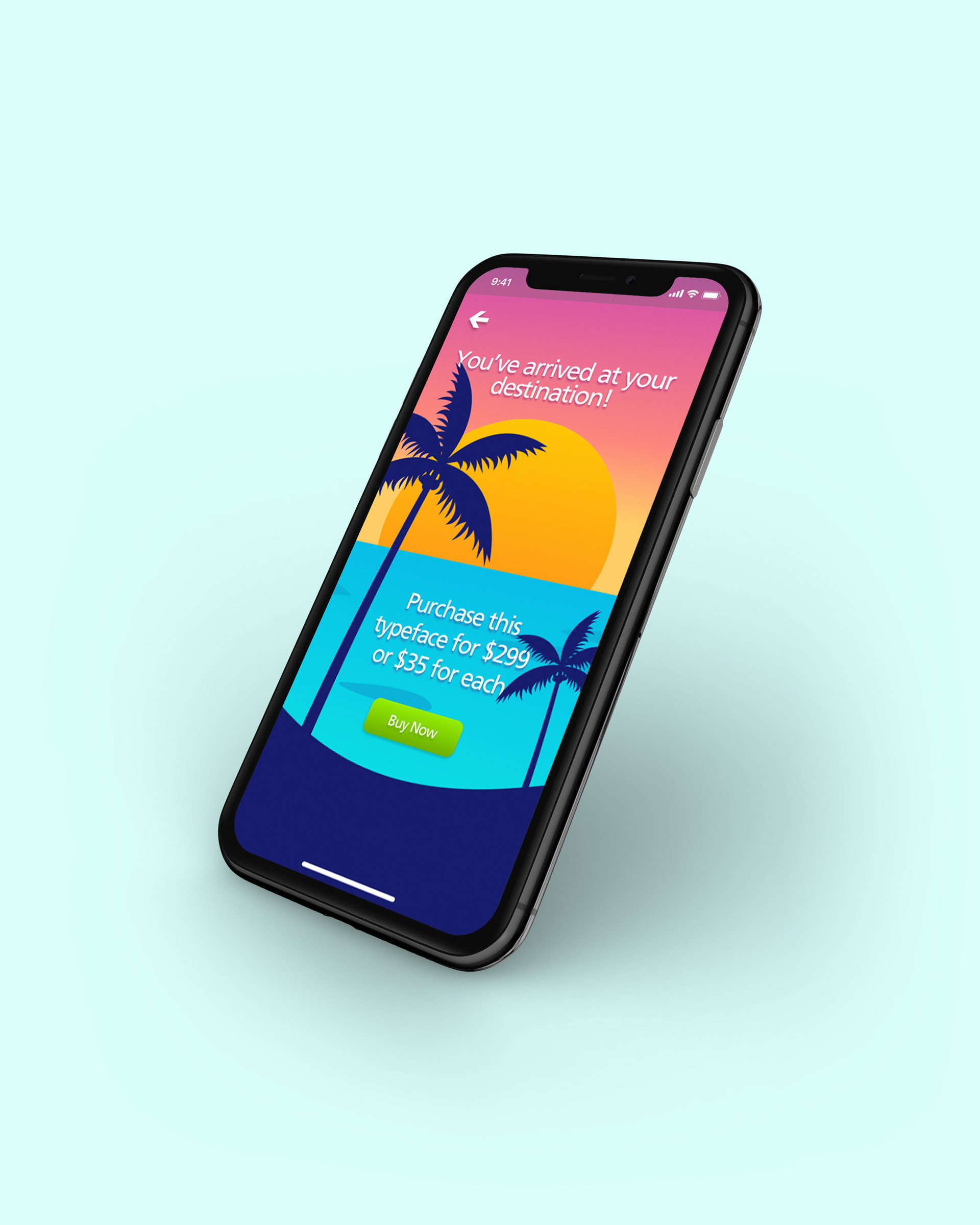
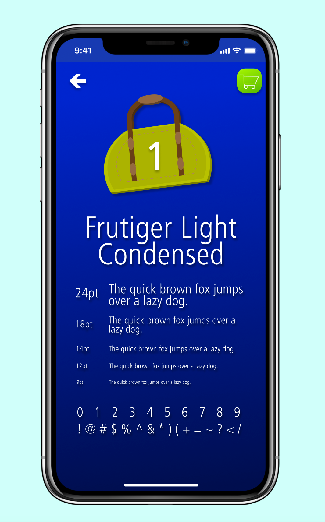
Since Frutiger was created for airport signage, my concept for this app was the based on the airport experience and each step a person takes throughout that experience. It starts with the road sign leading to the airport, takes the viewer to the check-in aspect of their experience through the passport design. After the check-in, the user is taken through security, where the anatomy of the typeface is further examined as if through the actual x-ray they use. The next step along the way is to their gate, as the user clicks through the gate options they are able to view the different places Frutiger is in use. Next, is the baggage pickup! Each suitcase is a different style that Frutiger is available for purchase in. Finally, the user has arrived at their destination-- the checkout page where they are prompted to purchase this typeface.