All new packages together
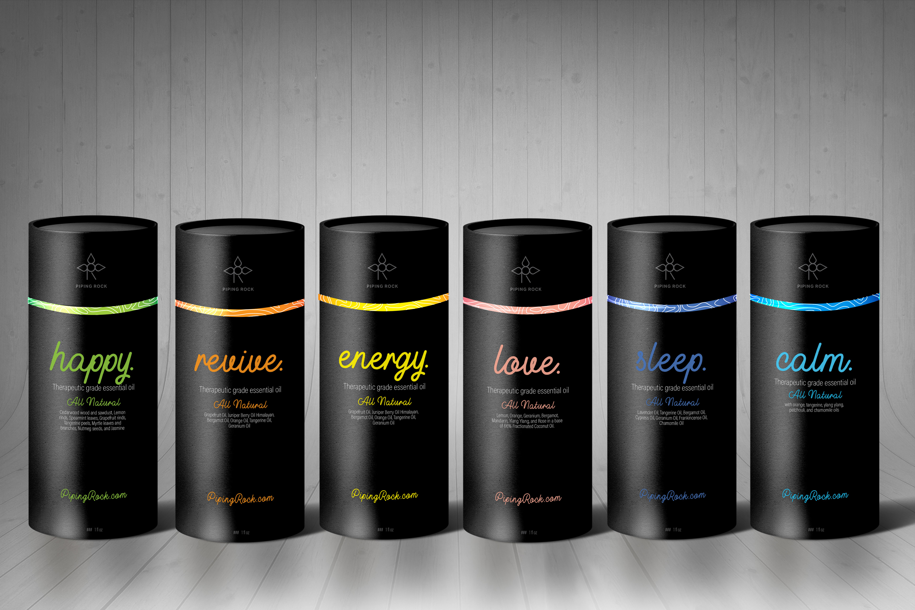
All of the individual oil packages lined up
goal
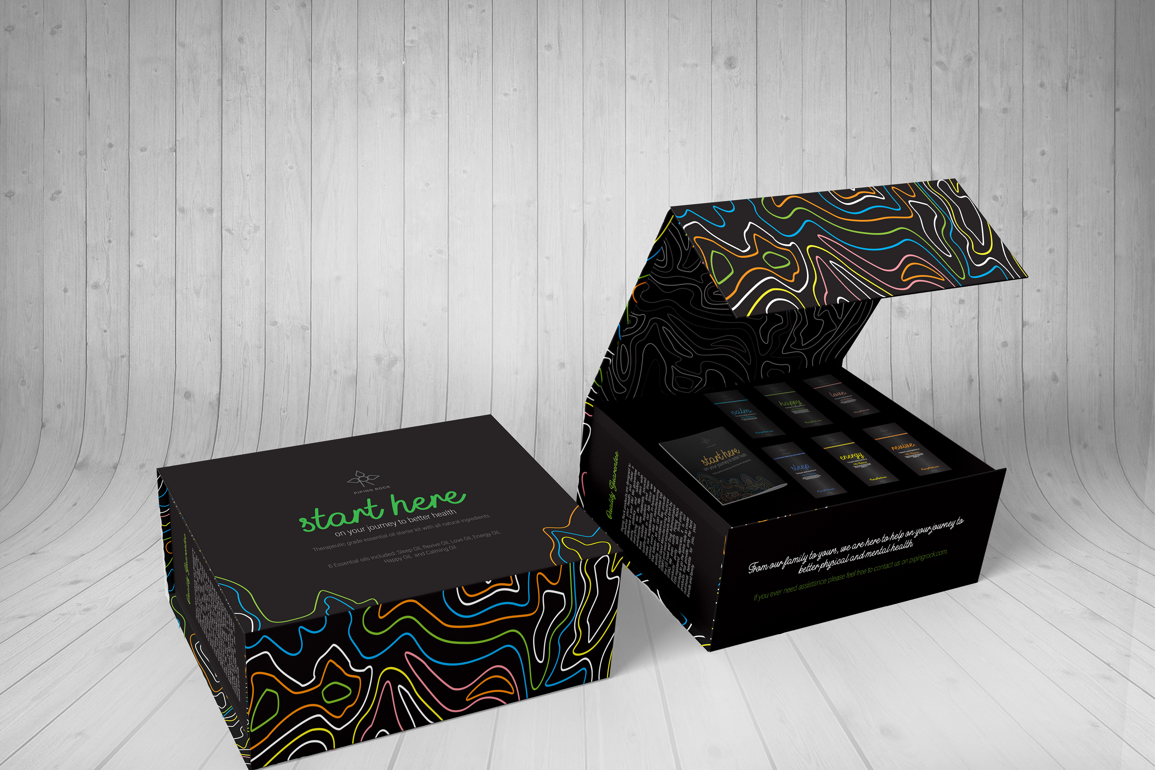
The goal of this project was to rebrand a company, I chose Piping Rock, and to chose 3 of their packages to redesign. I decided to redesign their diffuser box, their starter kit, and their individual essential oils. This company focuses on being all natural, family run, and keeping their costs low for their consumers, so I tried to honor all of these aspects in the new brand and packaging, without being overtly obvious and similar to the competition.
concept
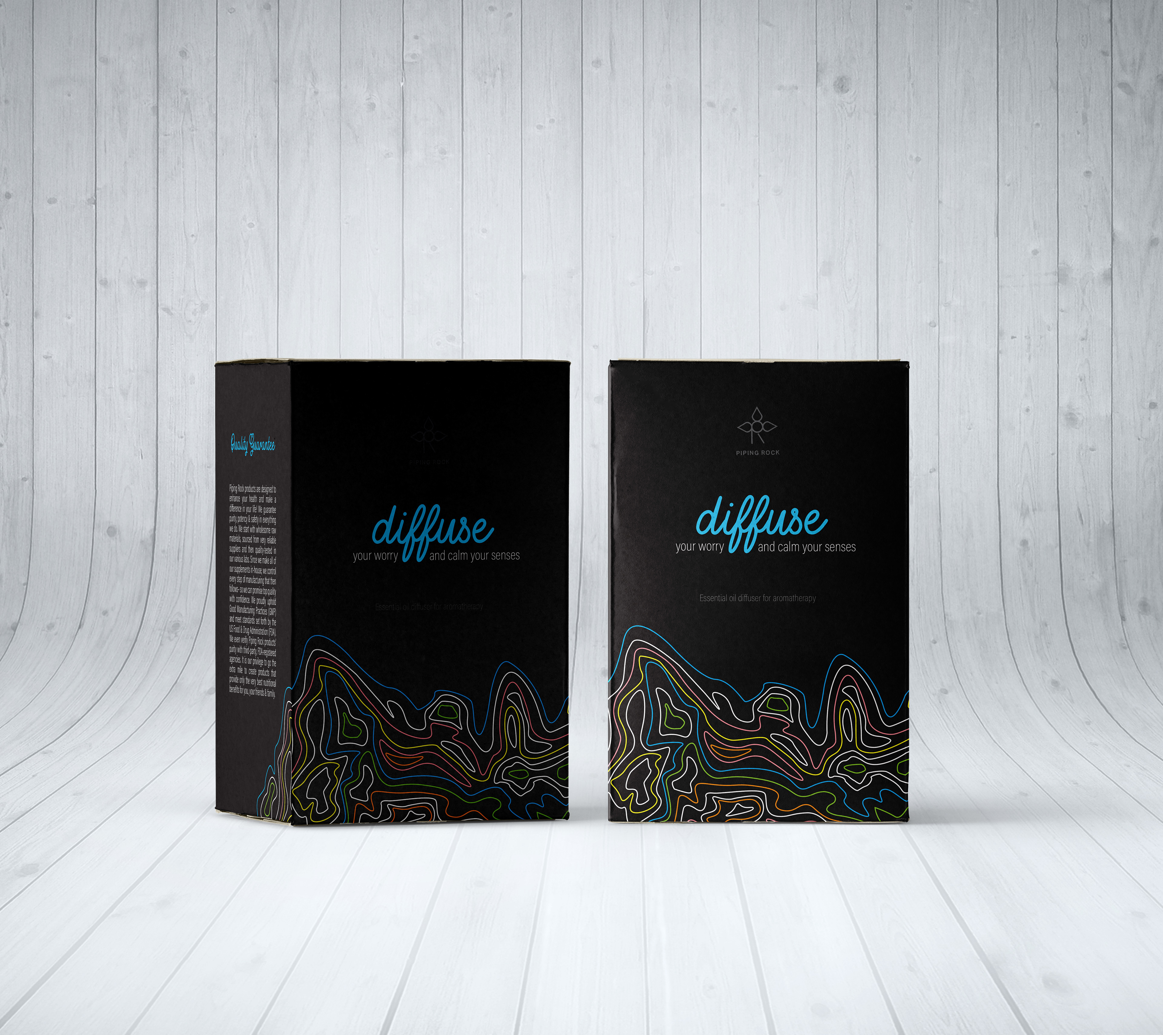
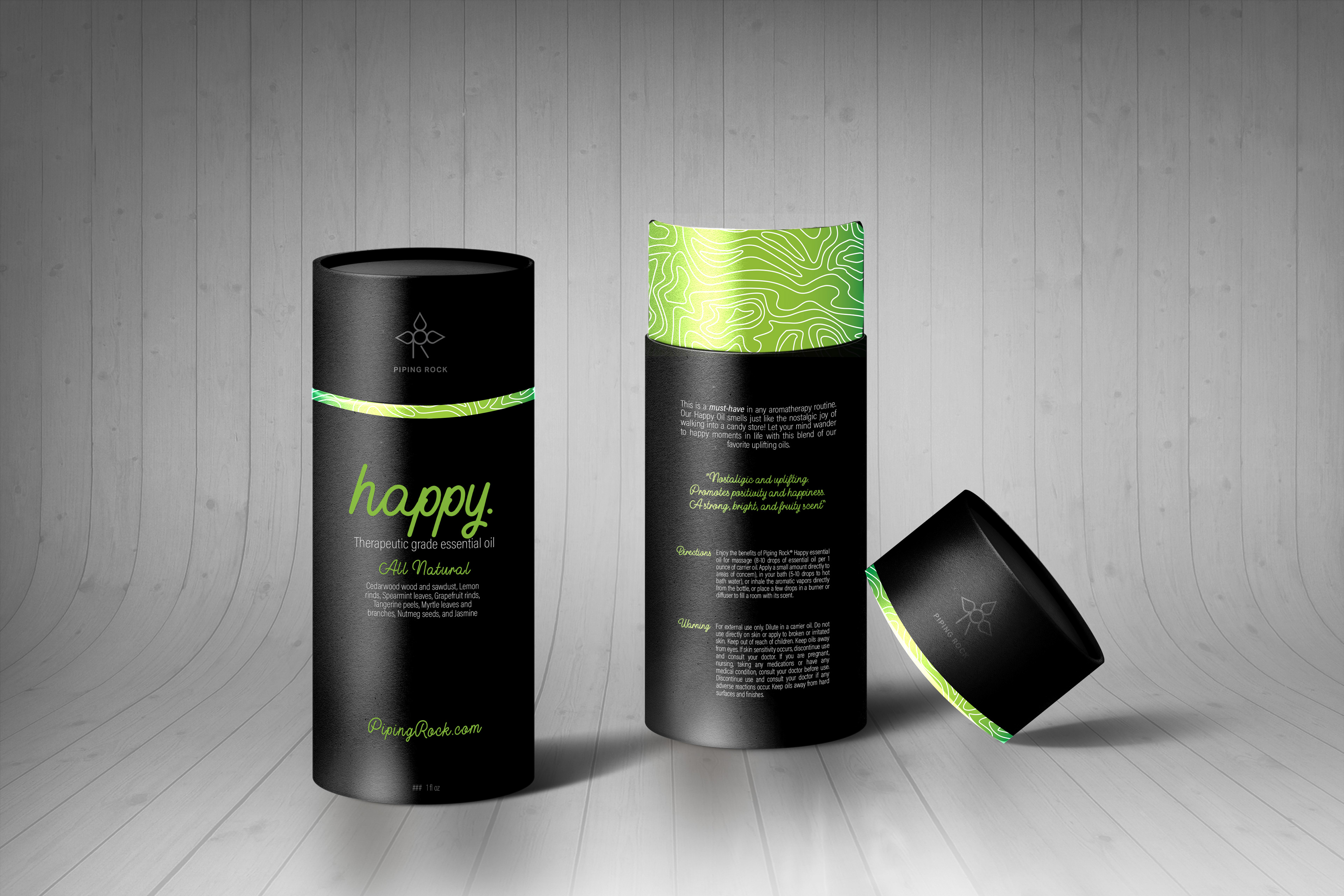
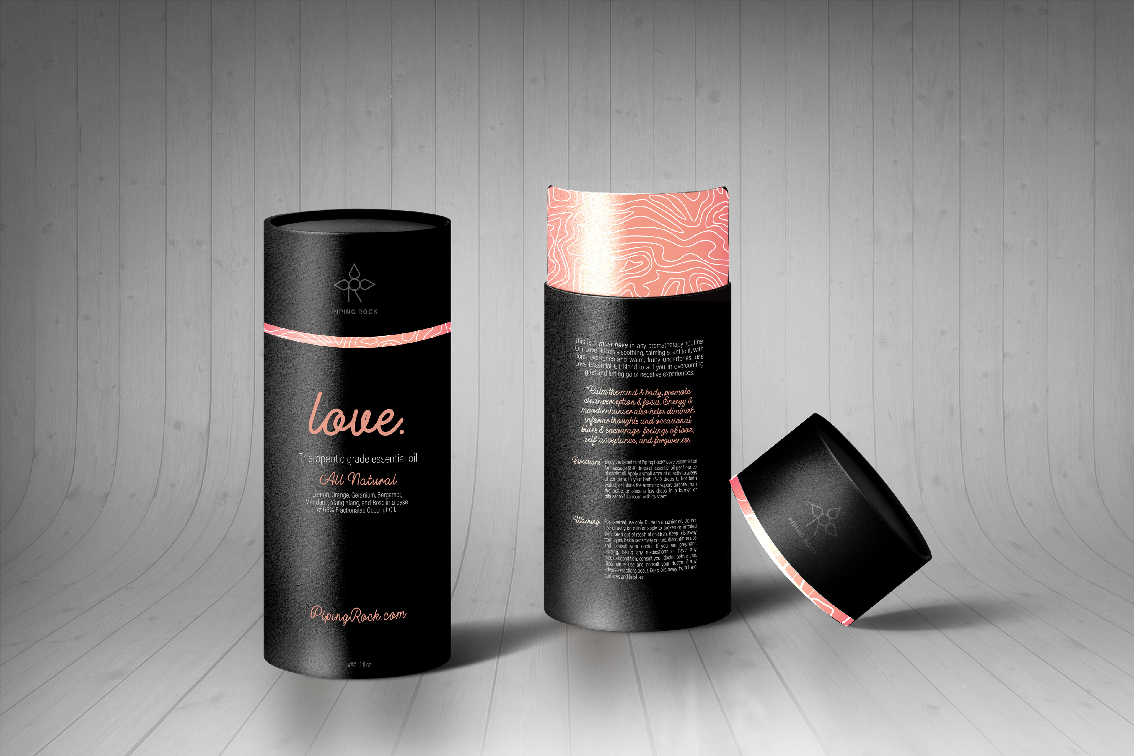
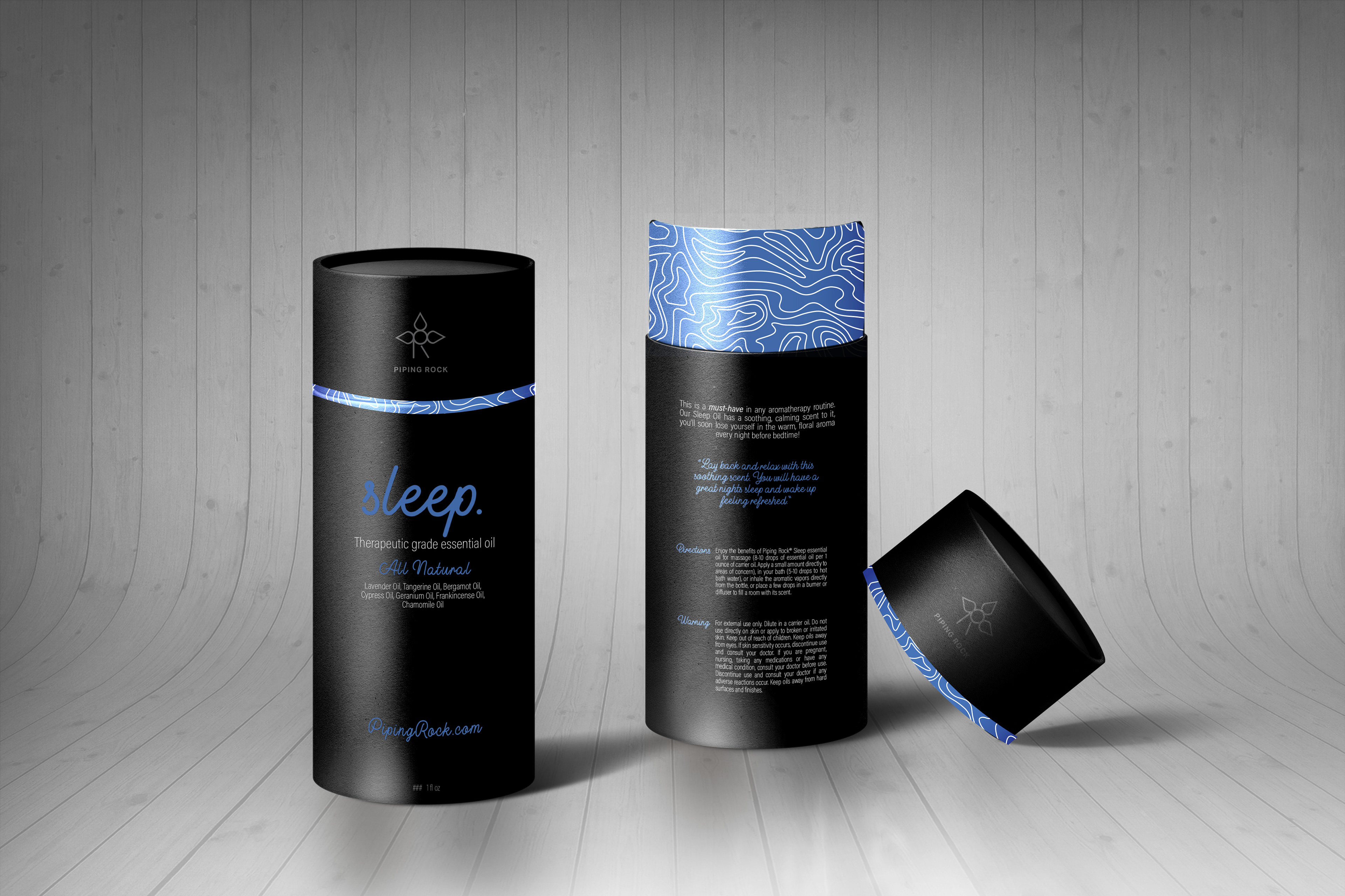
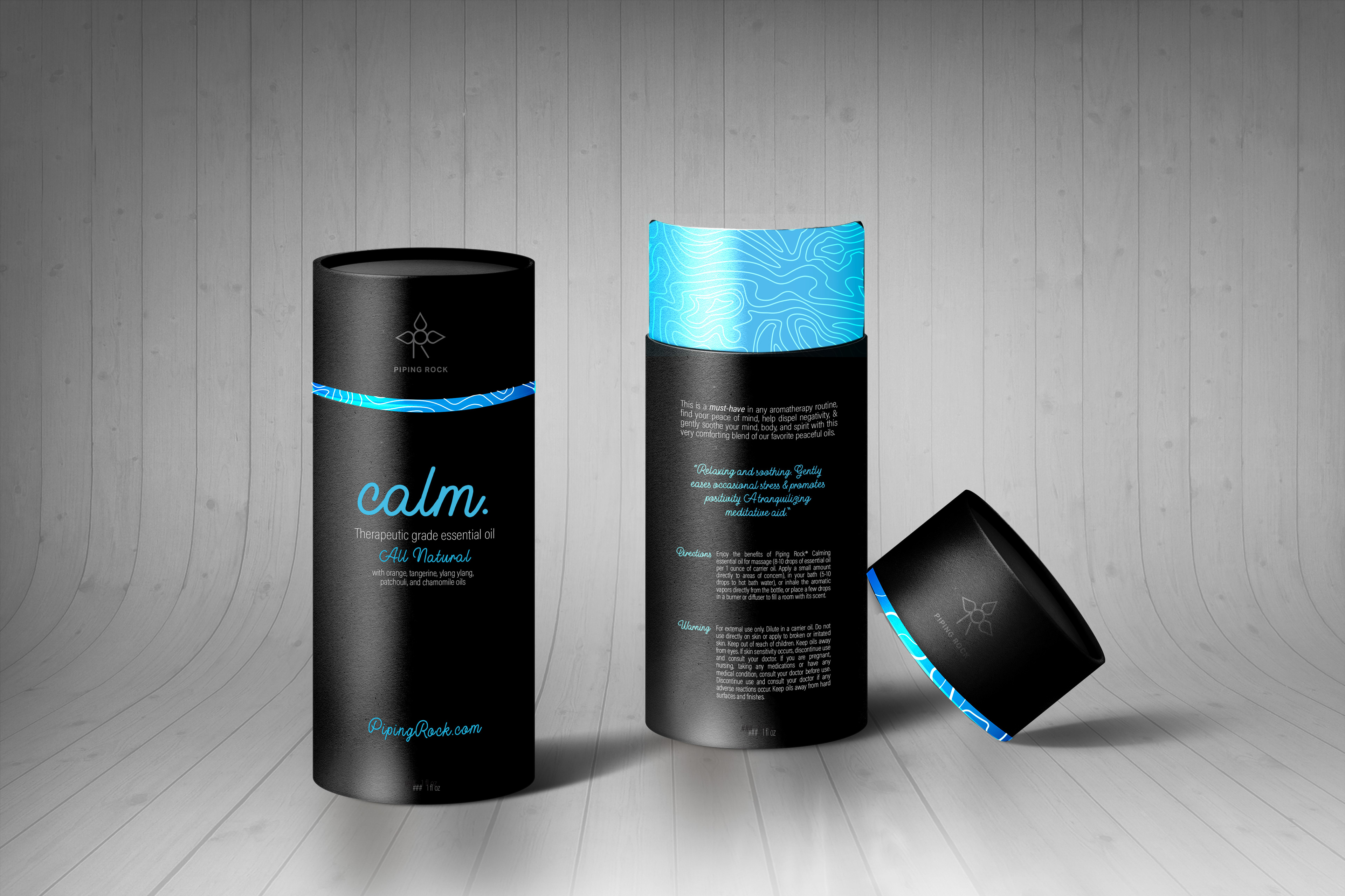
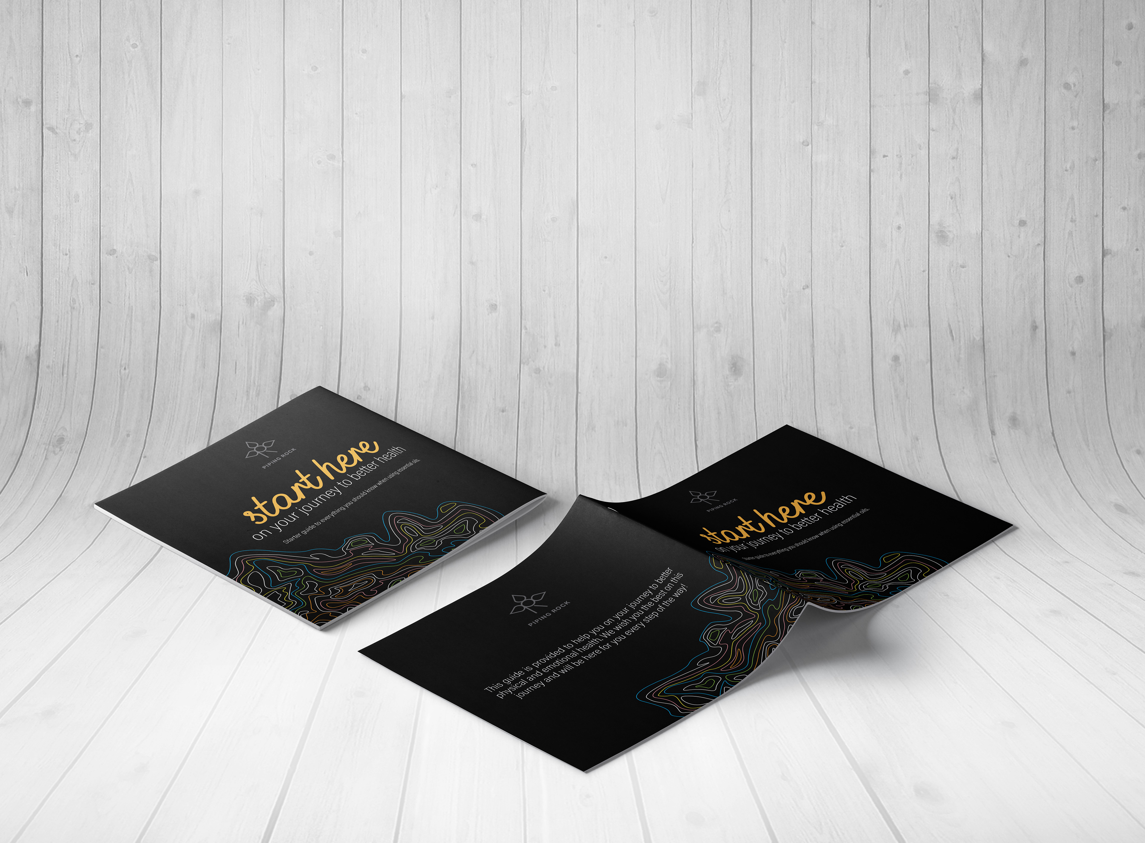
I wanted to create a sleek, professional looking brand while still making it approachable and likable. I chose to use a simplistic, black background with colors that represent feelings created by each individual product. The topographic map pattern that is visible on each package is of Ronkonkoma, NY which is where the company’s headquarters is located. For the logo, I created 3 leaves that can also be considered drops of liquid (both representing the natural aspect of the company. There are 3 leaves/drops to represent the 3 generations of family and the logo also consists of the letters ‘P’ and ‘R’. The script font (Buckwheat) along with a sans serif (Acumin Variable Concept) was chosen to create a friendly feeling while also maintaining it’s elegance and charm.
logos
The first photo below is the original logo. The second, more simplistic logo, is the one I created.

Before the redesign
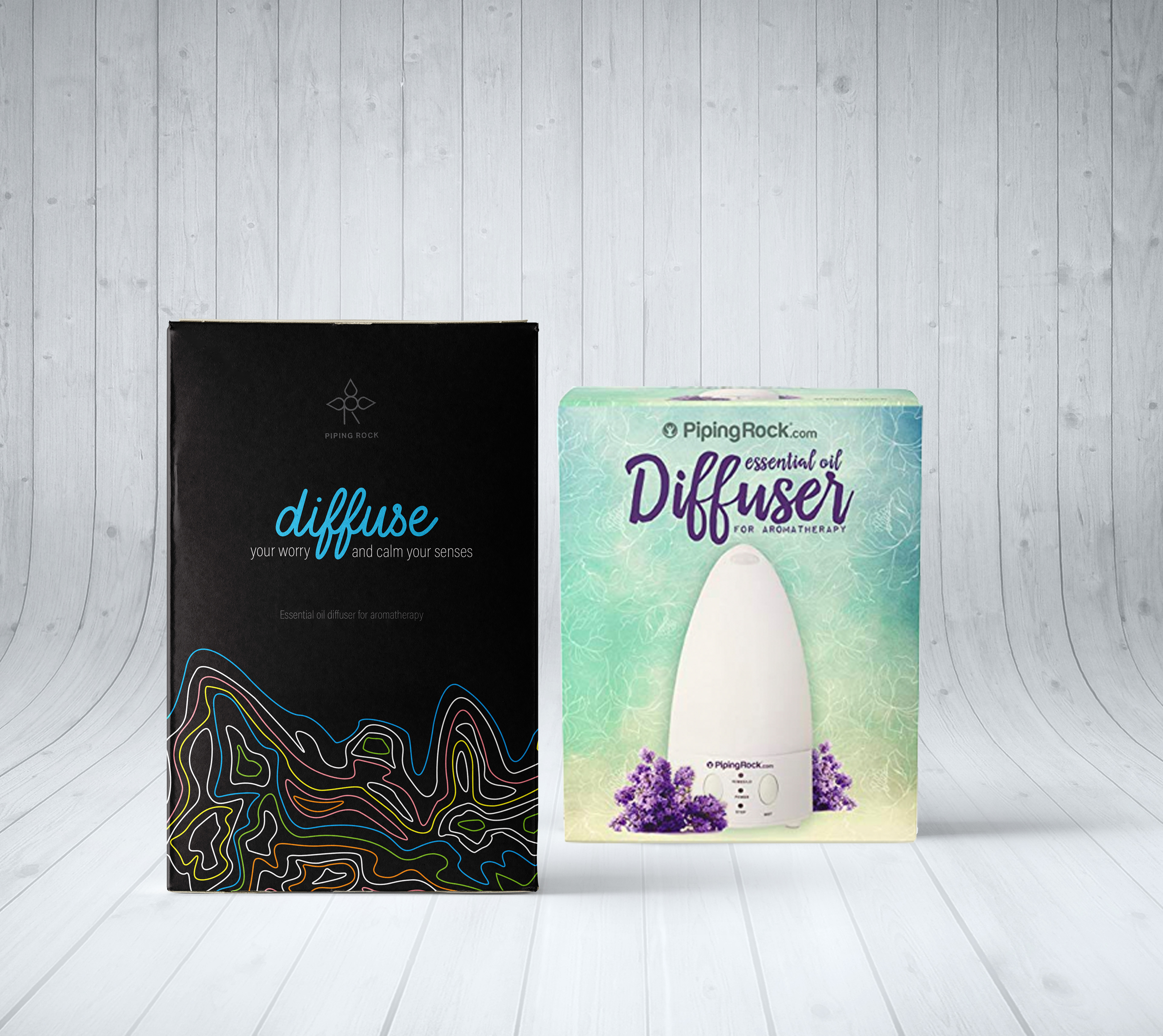
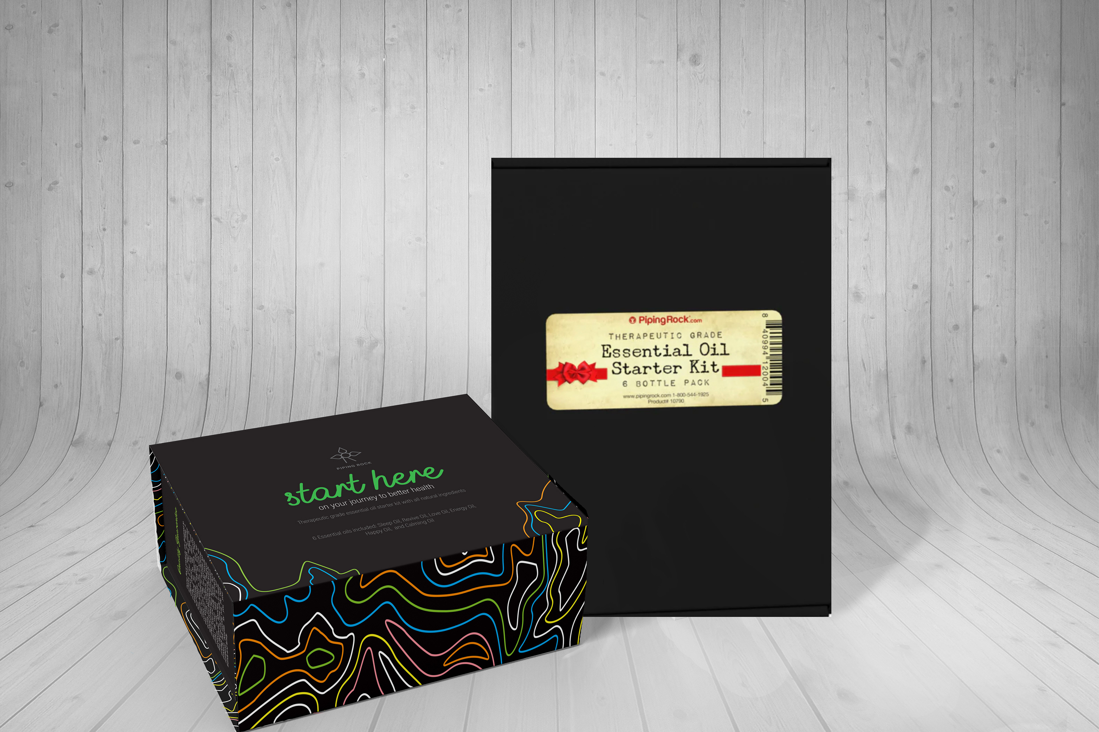
After the redesign
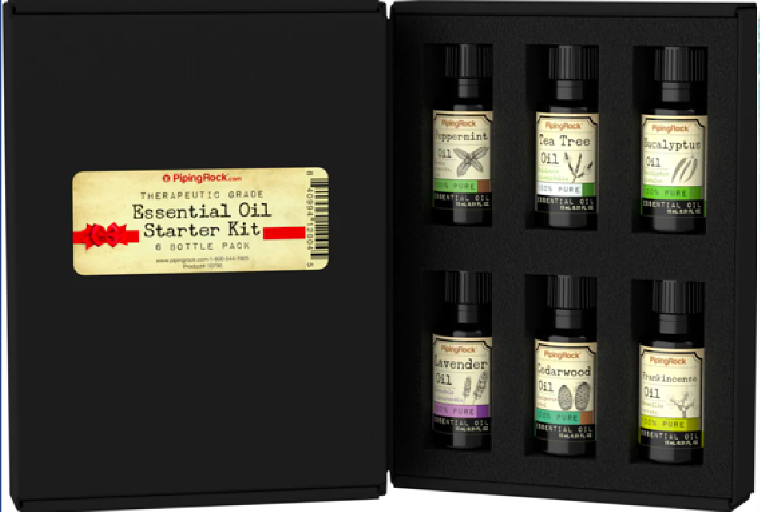
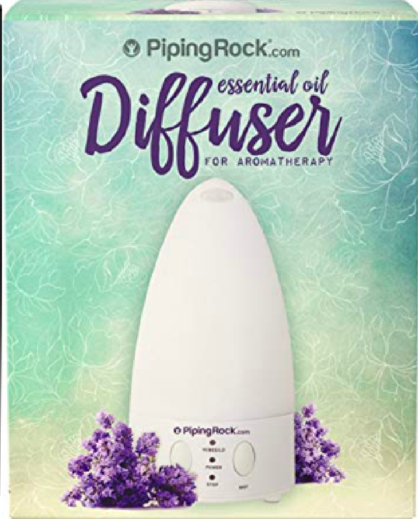
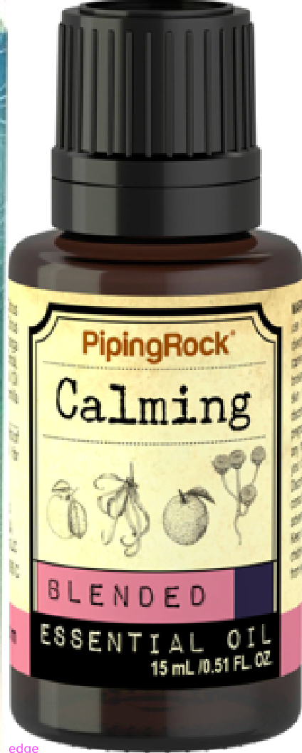
original packaging
The photos below are the packages I chose to redesign: The essential oil starter kit, the diffuser, and the individual oils themselves.
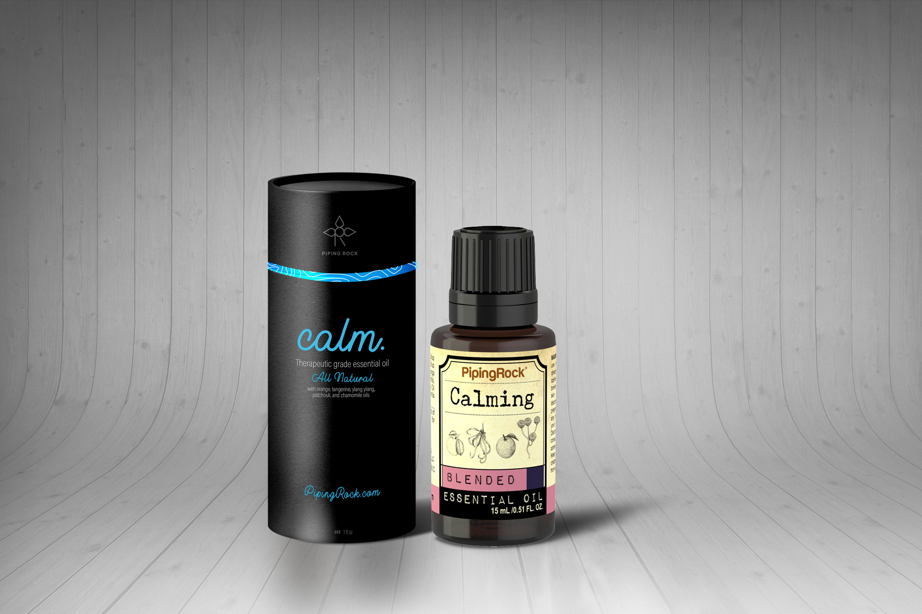
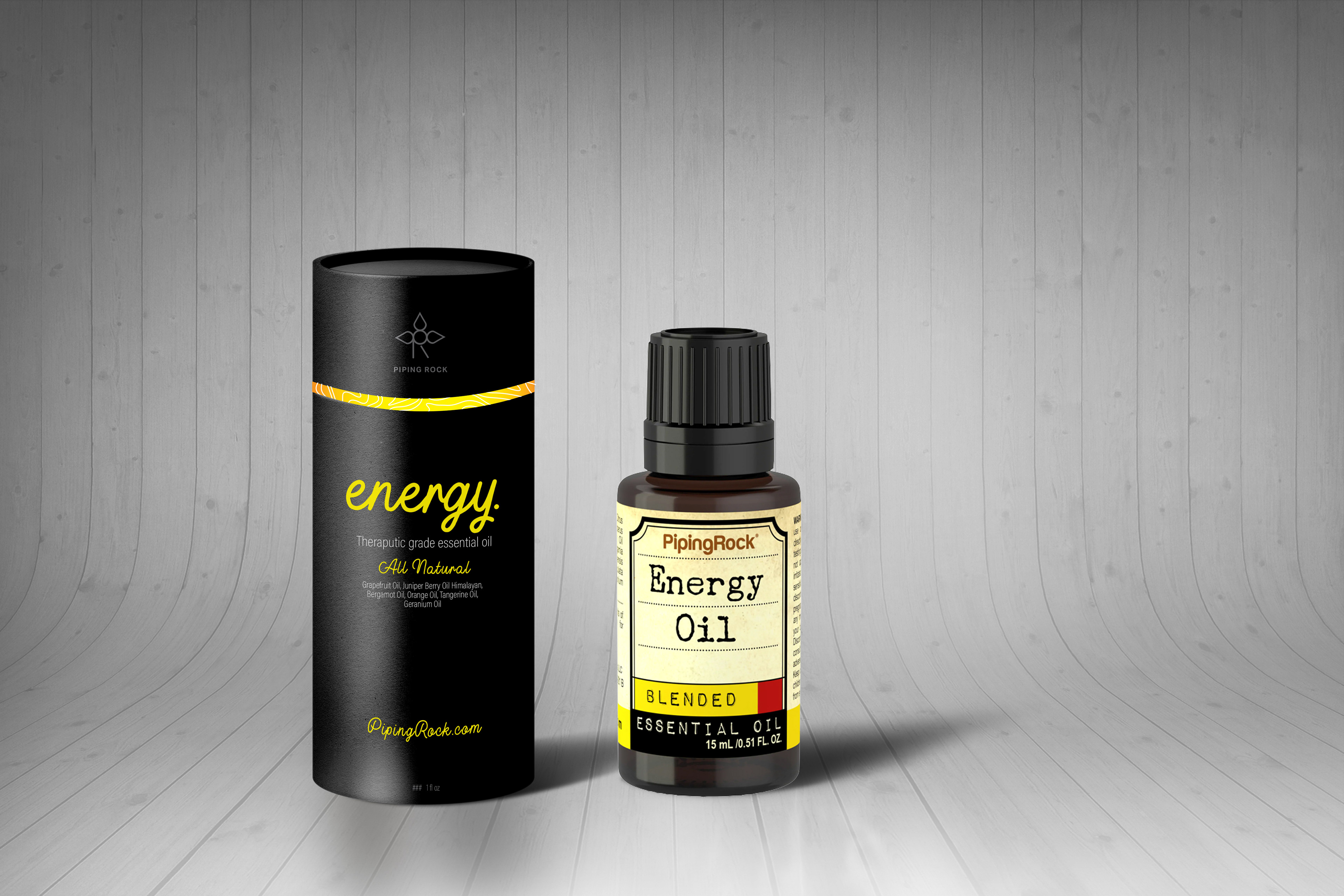
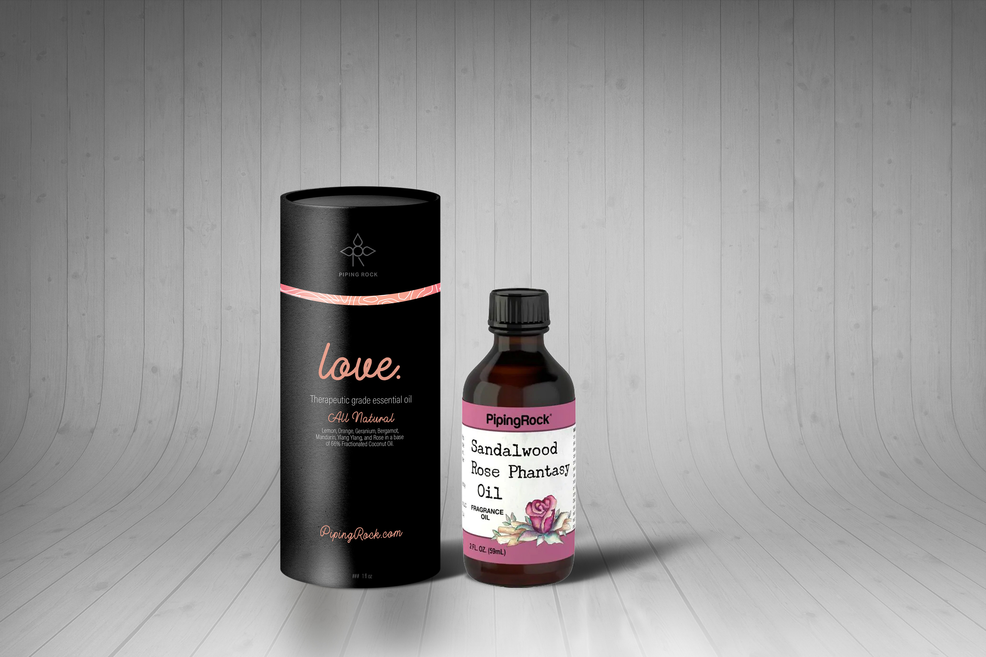
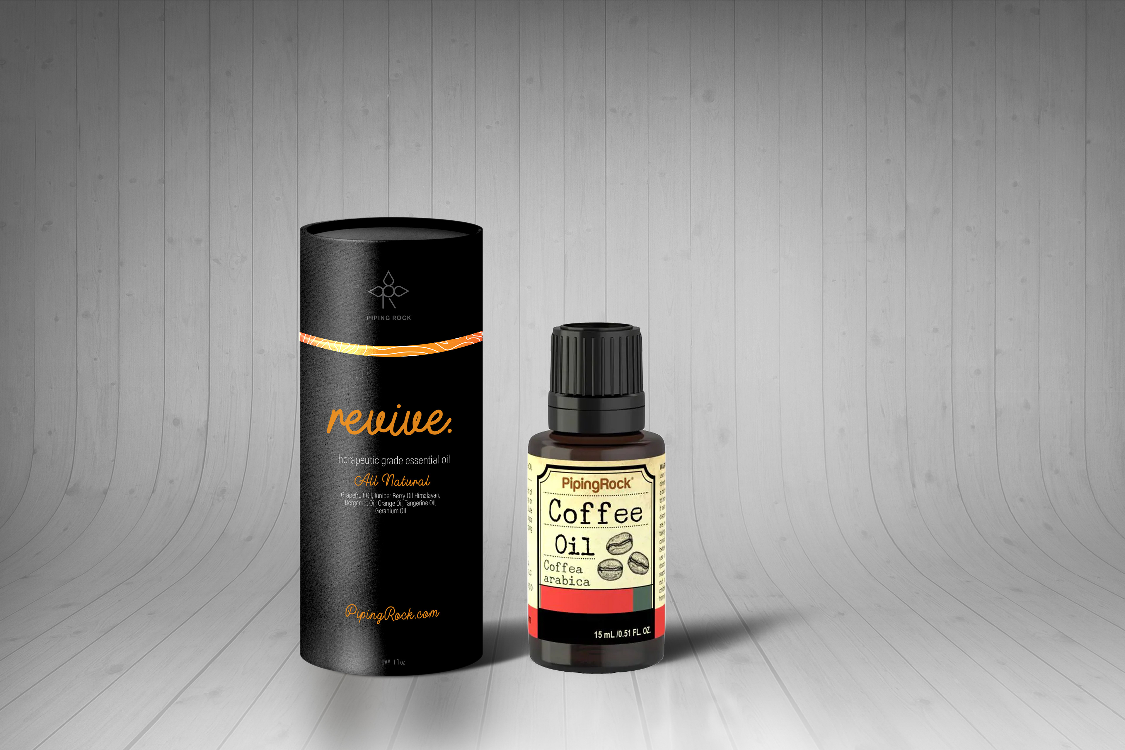
new individuals

The following photos include comparisons with the old packaging and the new packaging, and then the packages with the tops taken off and sat to the side.


new starter kit
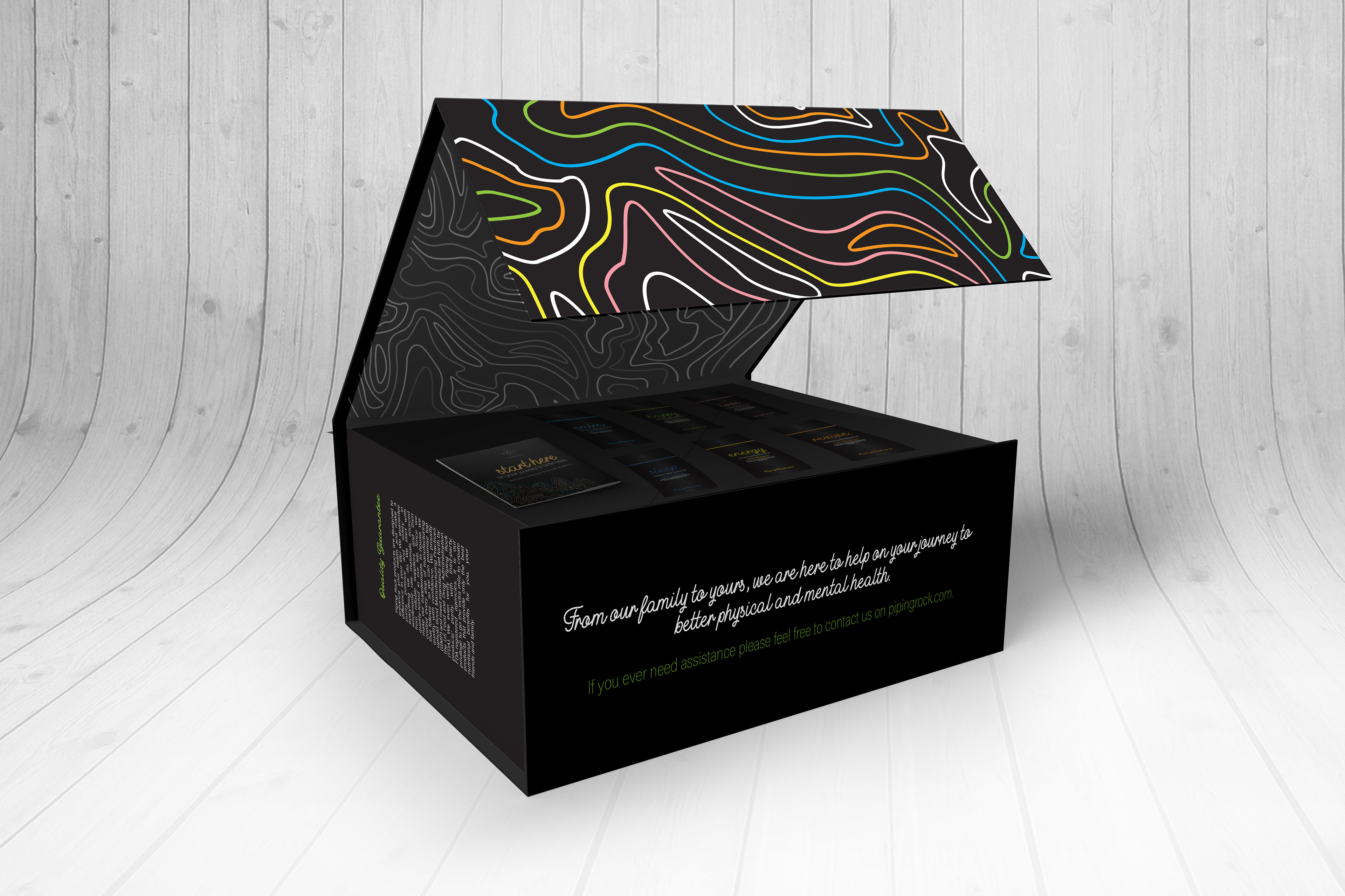
new diffuser