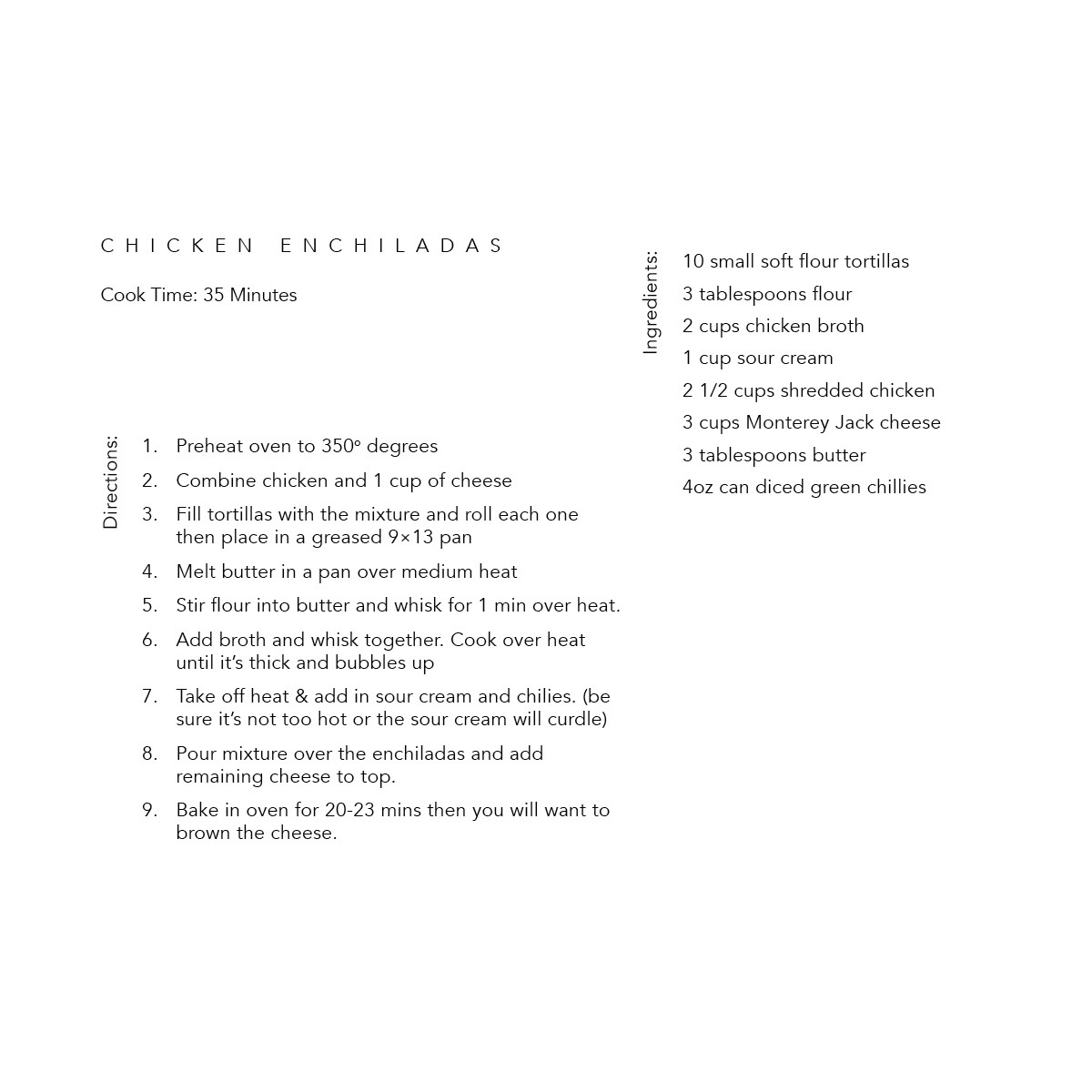
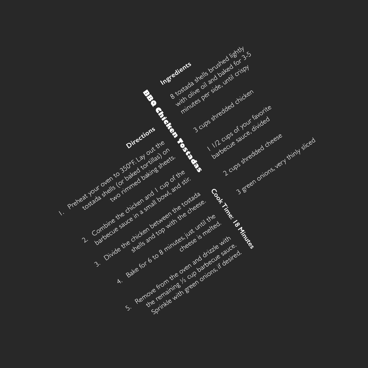
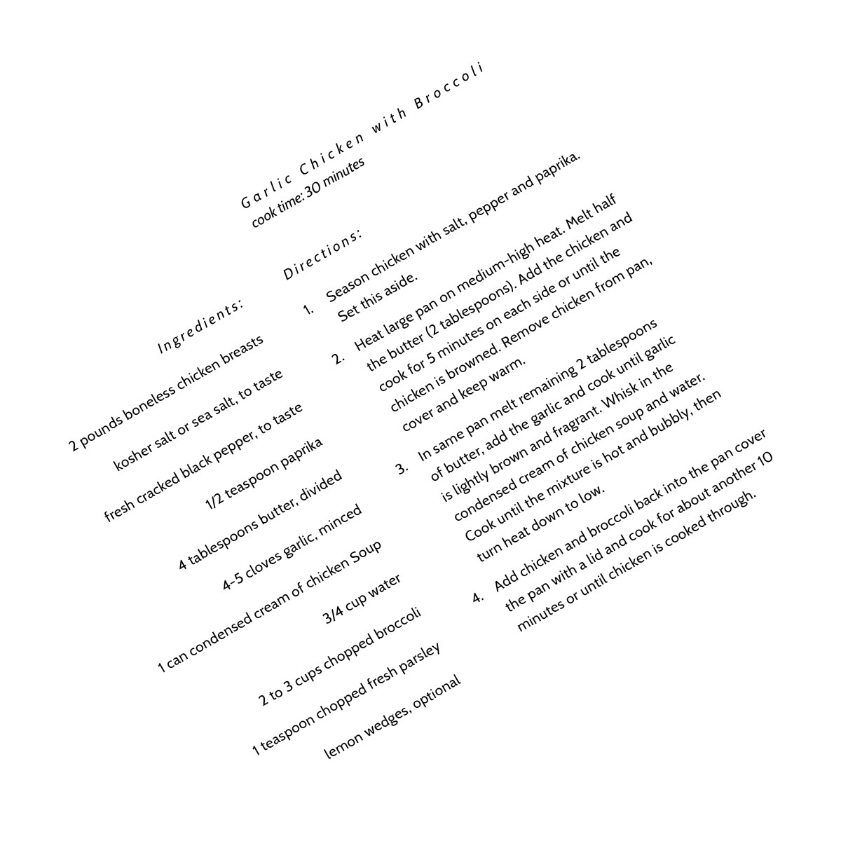
We were tasked with exploring different methods of creating hierarchy using proximity, contrast of size, font posture, thickness, and case.
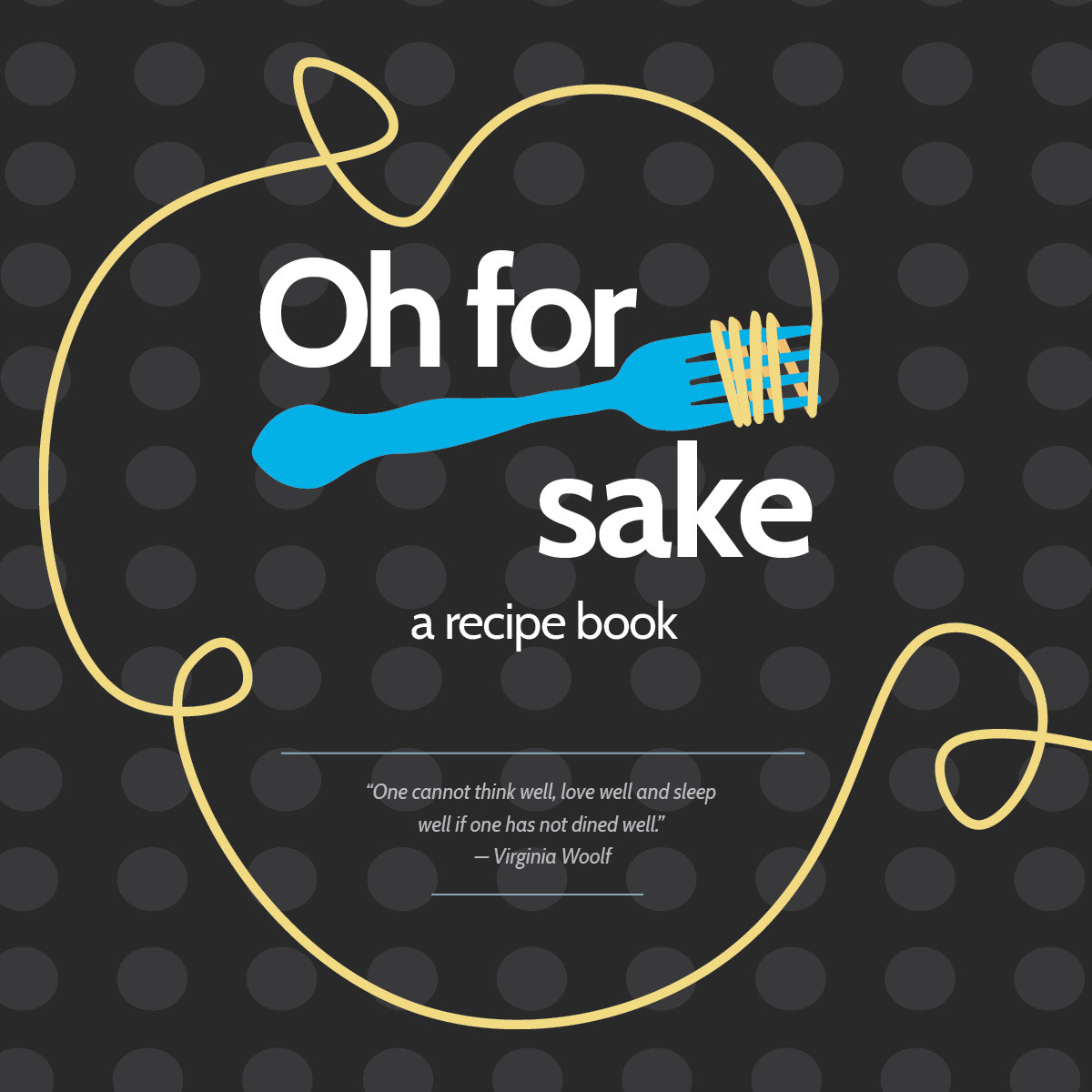
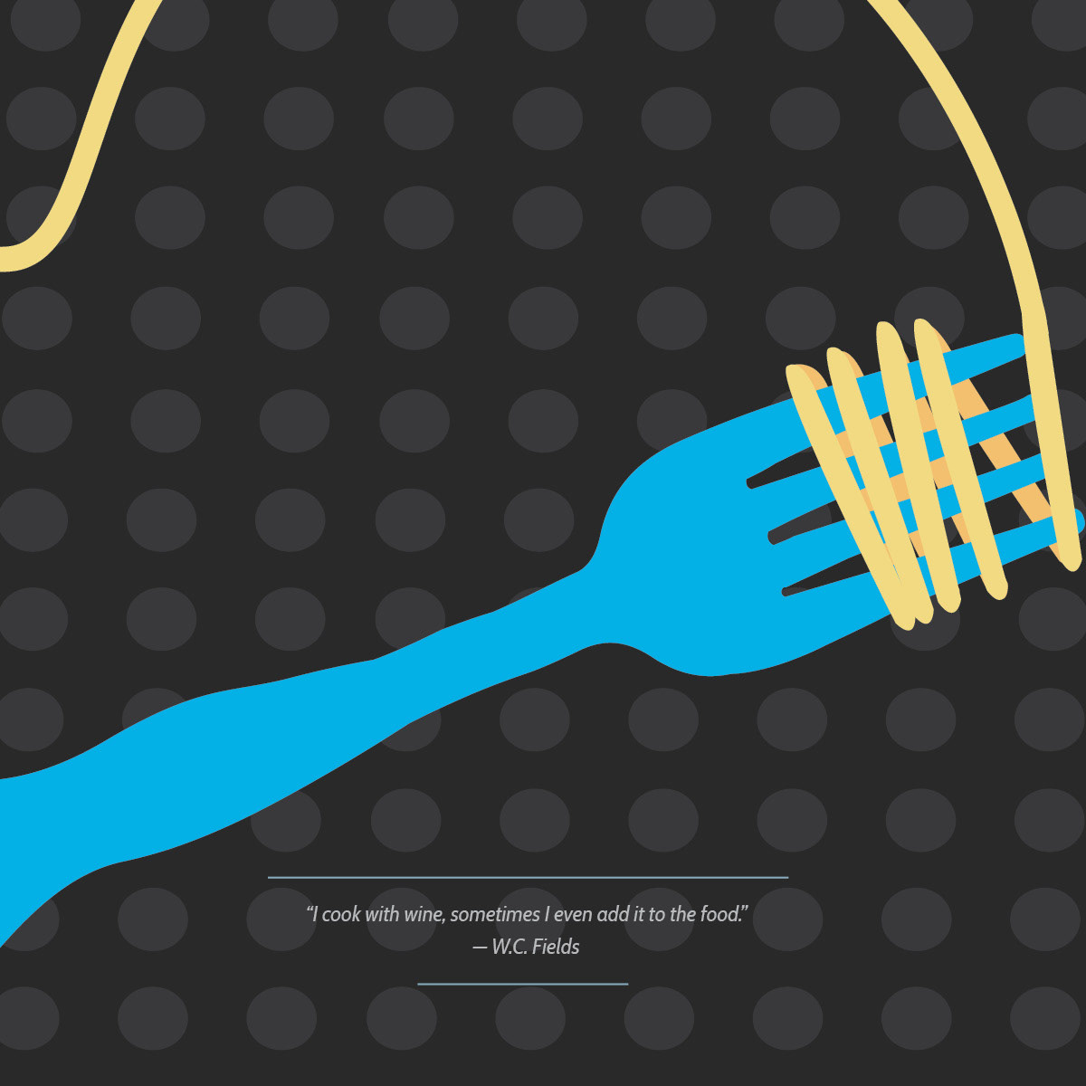
This is the cover to my recipe book. I included a faded pattern in the background, with a pun for the title, and a quote.
For the first page, we were required to create hierarchy on the page using only alternating case of the letters.
For the second page, I was required to create hierarchy on the page using only thickness (bold, thin, regular...). I was only allowed to have a colored background for one page, so I chose to use this page.
For this page, I was required to make page hierarchy using only the font posture (italic).
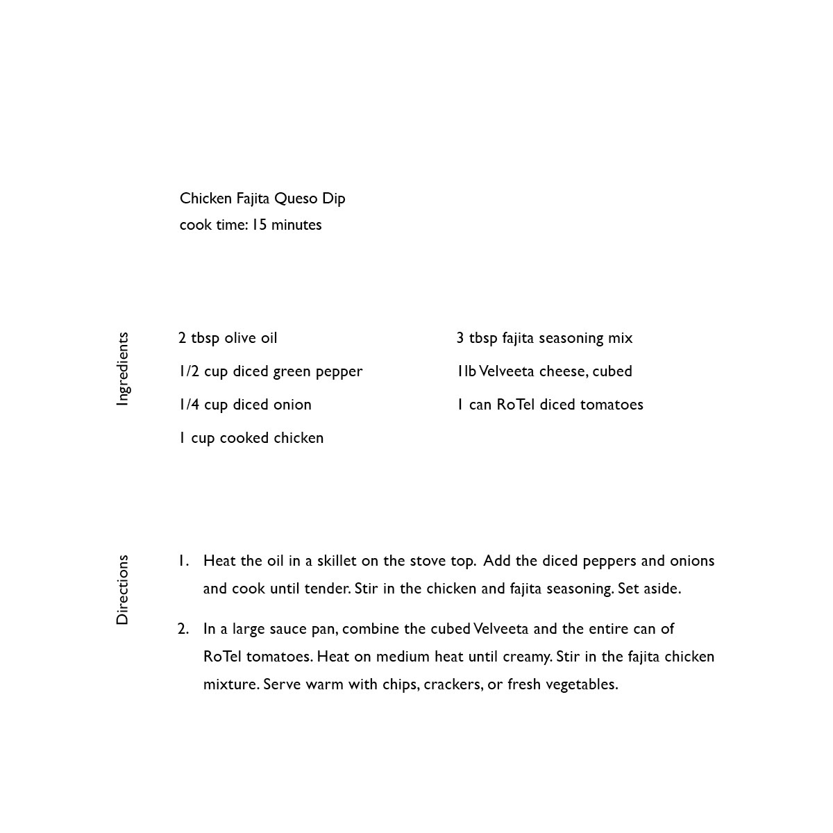
This page I was only allowed to use line spacing/leading to create hierarchy.

On this page I was allowed to create hierarchy using only visual punctuation.
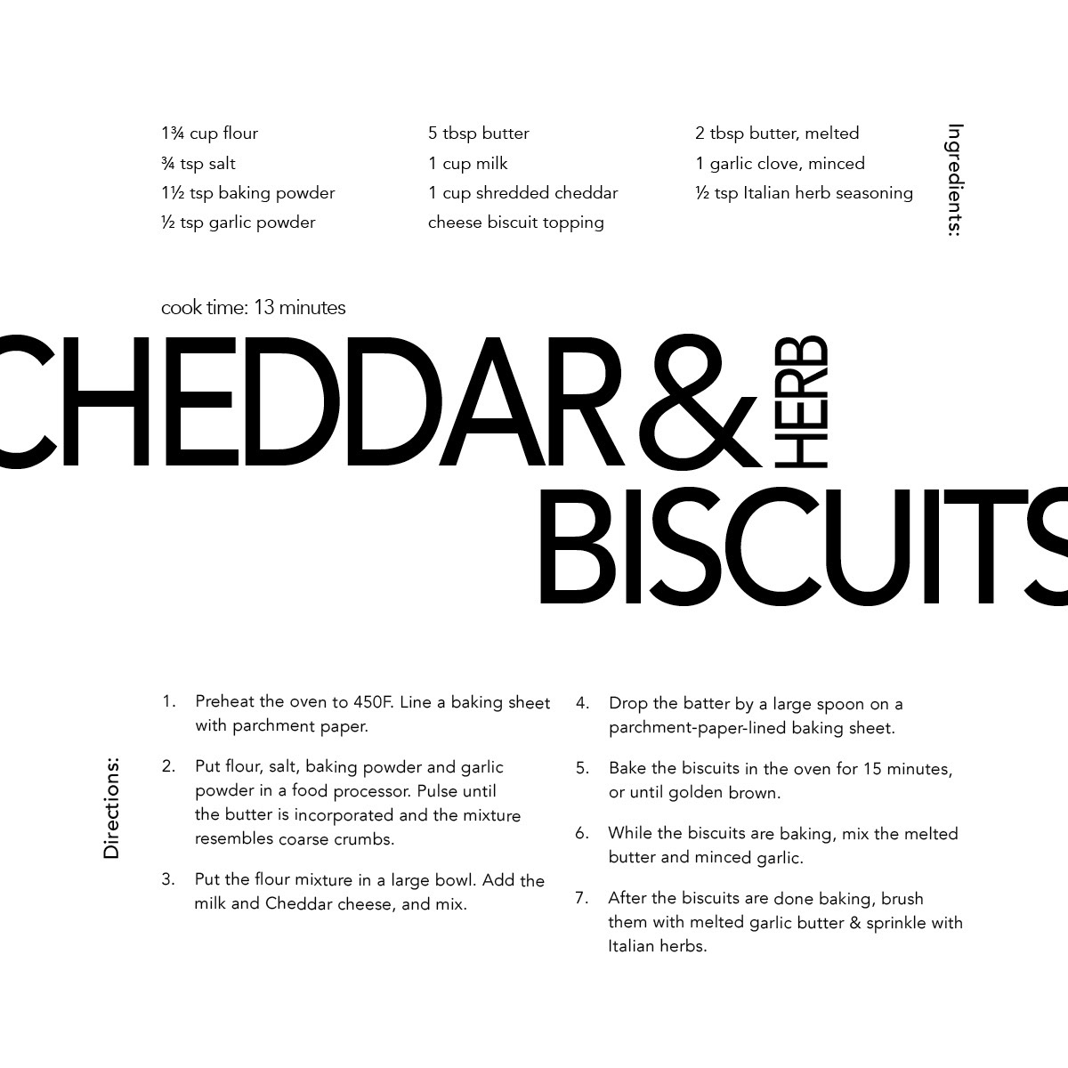
This is my favorite page. I was required to create hierarchy using only text size.
This is the back cover— it is visually consistent with the front cover.